As a user experience designer, sometimes, the smallest change to the user journey can have the biggest impact on customers, especially when the interface is central to your core business and revenue. I often get the chance to research customer pain points that in the end I fine just need a small code change in order to relieve a mix-up in the process.
Problem
The customer service call center was receiving many calls indicating issues with making payments online. The common complaint was that "The page just stays the same thing after clicking the 'Next' button and there is no error message either." After some quick research into the issue, I found that when the user did not have a bank account saved in their jea.com account in which to pay from, they were not being told what they needed to do. The user needed to be told that they must add a bank account in order to proceed.
Solution
After looking more in depth at our payment user journey, I realized that some small changes in the logic could clear up this issue without the use of error messages, or even allowing the customer to fail in the first place (which is a frustrating experience for anyone!).
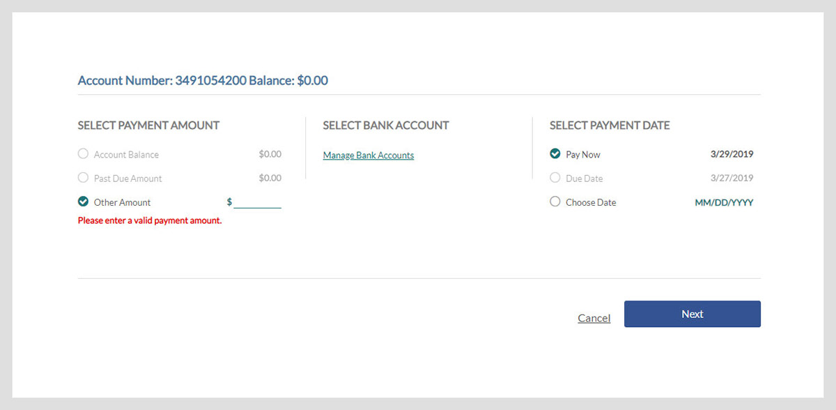
The three screenshots below describe scenarios where the user has not completed the necessary steps, yet are led to believe they can continue on the process - all because the 'Next' button is becoming activated when all requirements are not met.
The Next button should remain grey and inactive if there is no 'Other Amount' indicated or bank account on file to be used.
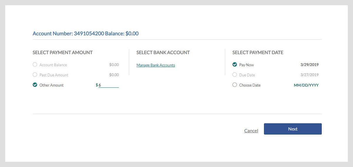
The Next button should remain grey and inactive if there is no bank account on file to be used.

The Next button should remain grey and inactive if there is no 'Other Amount' indicated.
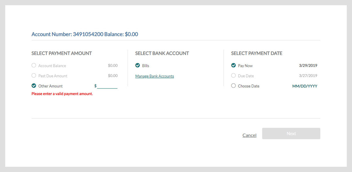
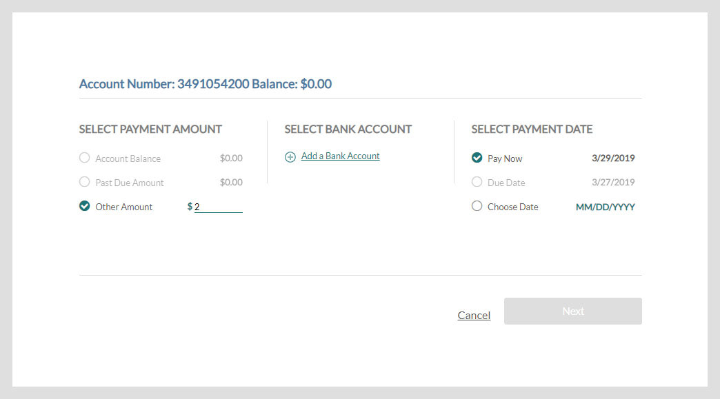
The two screenshots below describe scenarios where the validation process is working properly and the user is not allowed to continue on the process until the necessary steps have been completed.
ADDITIONAL IMPROVEMENTS
For those users who do not yet have a bank account in the system, I modified "Manage Bank Accounts" link to "Add a Bank Account" - users are now are driven to make an action. "Manage Bank Accounts" makes sense for users with a bank account already on file. A plus icon also illustrates that the user should add something that is missing.Users with the "Add a Bank Account" link are then be taken straight to "Add a Bank Account" page, rather than the "Manage Bank Accounts" page, therefore reducing the number of clicks and confusion.